----------------------------------------------
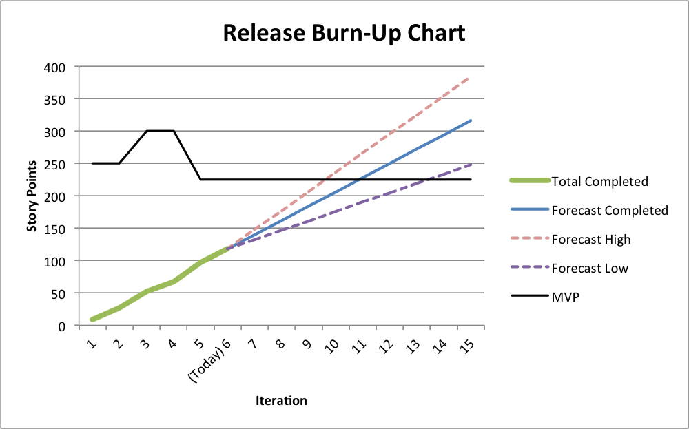
A release burn-up chart is used to track team progress and to develop data-based forecasts that can be used to help balance trade-offs in achieving a release plan. Charting data should be updated with each iteration. This will keep forecasts current much like an NOAA hurricane landfall chart.
Release burn-up charts are built using summed measures of work over time. In Scrum, this could mean story points per sprint. However it can also be used with other frameworks like Kanban, for example as work items per week. There are tools that will generate these charts but my preference is to use a spreadsheet for more control over the content and delivery. Here we will use Microsoft Excel to develop the release burn-up chart assuming the development team has just completed sprint 6 and would like to forecast out another 9 sprints. Value is measured in story points.
Keep in mind:
- Make forecasts, not commitments.
- Prepare to inspect and adapt.
- Good data will take time to develop so just get started.
The charts and tables can be downloaded as an Excel spreadsheet or as a pdf for reference.
| Start with velocity data, something the team is likely tracking already. | 
|
| In a separate cell, calculate the standard deviation for the last 3 sprints. We will use this value to establish reasonable* upper and lower bounds for the forecast. Here,
σ = 7.55
Create columns for forecast highs and lows where the value is equal to the forecast value + or - the standard deviation. The deviation is additive as the forecast extends into the future. Plotting the high and low values in addition to the average forecast should demonstrate a cone of probability. An alternative and perhaps simpler, non-statistical approach, is to use the average of the 3 highest sprints and 3 lowest sprints to establish the variance around the average. We are after accuracy, not precision, and this approach will suffice. * We will assume the data is normal (fits a bell-curve) and won't change over time. These assumptions are not likely to hold true, however this approach should provide a good approximation. Given these assumptions and using a standard deviation on each side of the average will result in a 68% confidence level. |

|

|
Perhaps more common is the desire is to know when a given amount of work will be done. This can take the form of an MVP (minimum viable product) as is demonstrated here. To show this, plot the magnitude of the MVP over time. Note this value may change as the business responds to market need and capability of the team. In this example, the MVP at 225 story points is likely to be achieved between sprints 10 and 14. |

|

|
| It is important to update the data on a regular basis, iteration boundaries being the most common time. In the example here, sprint 6 has moved to historical and 'today' is identified as sprint 7. Values have been updated, including the average and standard deviation for the last 3 sprints (sprints 4, 5, 6). You may notice that the cone width has been reduced. Greater predictability in the time is reflected in the smaller standard deviation, being reduced from 7.55 to 4.51. This may stem from the team hitting its stride, increasing predictability and improving forecast variability. Notice that the average velocity has gone up as well, from 22 to 25, and is seen as a slight 'tip up' of the cone. This coupled with increased predictability indicates achievement of the MVP as likely between the sprints 10 and 11. The evolution of the forecast from sprint 6 to 7 can be seen in the short video below. |

|

|
|


